Navigation pages are all about which essential pages belong in the menus of the header, the footer, or both. Experts strongly differ so, how do you decide? It’s not a 1 method fits all but there are a few requirements but more with options. So, keep reading to learn confidently where to place them for your particular site scenario. This is part of the Setup WordPress Website category and is mentioned in my Rebuild Website Guide post.
Where Do Navigation Pages Go in WordPress?
Navigation pages are commonly placed as a menu in the header and footer; however, on desktop views, they are sometimes shown in a sidebar. For specifics, long-time experts disagree on where to put links to the most common, basic items. The fact is, it’s not a 1 size fits all solution. So, here are a few, very important indicators that can help guide you on this listed here.
- Site visitor ease of using your site
- Current, modern trends of placement
- Search engine stated recommendations (although the search algorithm might be updated and no longer actually consider stated recommendations)
So, with that said, here are suggested locations of the initial pages every website should have and certain sections. They follow principles of making your site more navigable (easier for the reader) and changing trends. Also, don’t forget to consider including a temporary WordPress Post Roadmap Checklist for various initial pages to remember to insert them into header or footer.
For a full project guide, see my post “Website Project Plan” for a larger list of items to look over. Also, see my post on how to “Install WordPress from cPanel: 3 Ways“. You’ll need to ensure you installed WP correctly for the menus work normally.
Where are Menus Created or Modified in WordPress?
In WordPress, from WP Admin, go to Appearance | Menus | “Edit Menus” tab. It’s here that you create and edit menus.
Where are Menu Locations in WordPress?
In WordPress, from WP Admin, go to Appearance | Menus | “Manage Locations” tab. It’s here that you assign menus to these 4 standard types:
- Primary
- Secondary
- Mobile
- Footer
How are Menus Created?
You can optionally visit this below video to see how to create new menus and add navigation pages to them.
For Kadence, there are 2 ways. They are shown here.
- How to Use The Kadence Navigation Builder
- The Classic
Navigation Pages for the PRIMARY MENU
The navigation pages primary menu’s purpose is to give the site visitor an immediate method to traverse your site based on your key focus items, such as categories. It’s typically placed in the Header in Desktop & Mobile devices. Here are the considerations to assign this menu location.

HOME Page for Primary Menu
- The Home page, by default, is required. Since the domain’s URL is on the logo and sometimes site title, you can optionally de-clutter header. In other words, you can skip having a navigational menu item named “Home” nowadays. Although that’s a trend, I still encounter people (in 2025) of all ages who don’t know to tap the logo to get back to the home page. So, depending on the site’s audience, I might still have a “Home” option on the navigational menus.
- Also, it’s a good idea to have “Home” as part of the breadcrumbs URL path.
ABOUT Page for Primary Menu

- This is minimally required. But, it’s currently trending to be in footer only and NOT in the header.
- This is to de-clutter header but, depends on your site focus, niche, and target audience. For example, if you’re a not-for-profit organization, it’s a good idea to have this in your header AND footer.
CONTACT Page for Primary Menu

- This is minimally required. Location depends on your target audience and site focus. If you actively have site visitors frequently communicate with you, then it should go in header. Otherwise, only in footer.
SUPPORT Page for Primary Menu
- This is an optional page. If support is a common service, this should have a link on the header at least. It can also be in the footer.
- Examples of site focus that generally need the support page link in the header are:
- software
- technical hardware
- services
- repairs
- parts stores
CATEGORIES Archive Page for Primary Menu

- Category pages are dynamically created archive pages. Regarding navigation, it’s required to show most, if not all of your categories in your primary menu in the header.
- If you don’t like the WordPress default template for all Archive pages (includes Categories), read this great article: “How To Create Custom Archive Loop Templates“. It covers Categories and also has a video too.
- Most often, you’ll want to exclude the default “Uncategorized” category from any menu.
- Subcategories are not required to be shown in menus but are good to have present, as they’ll appear as submenu items.
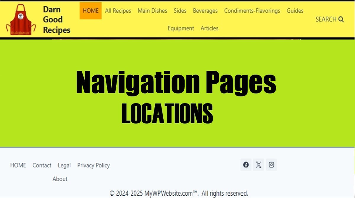
LOCATIONS Page for Primary Menu

- This is an optional page and usually applies mainly to brick-and-mortar buildings with more than 1 location. Generally, for frequent consumer visits, it should be in the header and optionally, also in the footer.
POSTS Page for Primary Menu

- This is an optional page. If used, it can be shown in either the header or footer, or both.
- In WordPress, this page is assigned in the same location where the Home page is assigned to the site. To assign it, from WP Admin, go to Settings | Reading.
- Also, it can be modified to show all posts or just recent ones. Therefore, naming this menu item should be altered to reflect as such, e.g., Latest Posts, Newest, All Posts, Recent Articles, etc.
- For Desktops, you can consider to place it in a Sidebar Panel. That keeps it off your header and footer. However, you’ll then want to consider it in your Mobile Navigation Menu somewhere.
SEARCH Page or Function for Primary Menu
- This is an optional page and optional function. It’s nearly always on the header and sometimes on the footer also.
- If your site isn’t tiny, it’s strongly suggested to present at least a search function. The results will be returned in a dynamically generated archive page. It’s available on most themes.
- Applying a Search Function can be just a simple search icon (spy glass) or a Search Bar.
- There are various ways to create your own Search page but you’ll need to know how to redirect the search function to point to it.
FOLLOW Section for Primary Menu

- This is an optional section. It’s just an area listing your active Social platforms. It’s only in the Header area if you’re heavily involved in that type of media. Otherwise, it’s just in the footer.
- It’s also a consideration to just use in the Contact page. Also, an option is to include it in your post’s template (if accessible) so you keep the header and footer less cluttered.
Navigation Pages for the SECONDARY MENU
Also, in some cases, a site will want to have an additional second or third row using a secondary navigational MENU in its header. These are usually altered visually to show a separation, like a background shading, a slightly smaller or grayed font.
Another use for a Secondary Menu is to have a different footer navigation for mobile devices. Read a bit about “How to Add a Secondary Menu in the Website“.
Examples of 2nd or 3rd row header navigational pages menu items might be things like these:
- Locations
- Offers (or Deals, On Sale, Flash Sale, Specials)
- Featured
- Events (or Calendar)
- Breaking News
- Alerts
- Your Saved Lists
Navigation Pages for the MOBILE MENU
The Mobile Menu location allows for a separate menu for mobile devices such as phones and tablets. However, it also allows you to assign another menu to this location. Many will co-assign the primary menu to this Mobile location. So, in effect, the pages in the mobile menu will match the primary menu. There might, however, be some menu items unique for mobile devices, e.g., “Test this phone”.
Also, you can read more about the “Kadence Mobile Menu” for creating and personalizing its appearance.
Mobile MENU Icon
Many sites will have a full menu for desktops and a menu icon for tablets and mobile devices. Mobile navigation has its own design and layout appearance for its own settings, even though it can share the same actual menu contents as the Primary Menu.
- Shifting trend is to have the multi-line horizontal bar icon representing the menu for all devices, not just for mobile.
- The older “hamburger menu”, 3 lines icon is trending away to be just a 2-line menu icon. However, the 3-line icon is still a good one and is more noticeable than just a 2-line menu icon.
- If allowed, the small lines menu icon can also have the text “Menu” to appear beside it. However, not all themes have that option for a menu “label”. If your site’s target audience is tech-savvy, you won’t need a label.
- Some sites use the vertical 3 dots but generally this should be reserved for other types of “short menus”, not navigational menus.
Mobile Menu SEARCH Icon
- Some sites will have just a brief search icon, a search bar, or a URL leading to a search page.
- As an icon, this can be minimally a spy glass icon. But, the best is to have a search bar with a text box.
Navigation Pages for the FOOTER MENU
This section is all about what navigation pages belong in the Footer menu. Also, you can read this article specifically about “How to customize the Kadence Footer“. Or, for a set of short steps read “How to add a Footer Menu“.

HOME Page for Footer Menu
- It’s okay (and trending) to have “Home” listed in the footer, regardless if it’s also in the header. Also, some sites only put the “Home” page in the footer but do still have the Home page’s URL in it’s site logo and site name in the header.
ABOUT Page for Footer Menu
- This is minimally required. Trending is for footer only. This trend is to de-clutter header but, depends on your site niche, topical focus, and target audience. For example, if you need to emphasize what your site (i.e., you, your brand, your company, your organization) is all about, then include it in header and footer.
CONTACT Page for Footer Menu
- This is minimally required. It’s trending to be only in the footer, as a means to de-clutter the header. However, this is only if you have low need for site visitor’s communications. Otherwise, it goes in header. It can be on both header and footer.
- You can still have good communications with site visitor’s by allowing comments in posts. The Contact page itself is intended for stand-alone communications.
PRIVACY POLICY Page for Footer Menu
- This is minimally required. It’s VERY important to have this page identified in the WP Admin under Settings | Privacy. Some search engines look for this as a basic trust requirement.
MISSION Page for Footer Menu
- This is an optional page and can include a “Mission Statement”. However, it’s recommended to have for site visitors, in some cases, for non-business entities or others like education, some organizations, nonprofits, religious, and others.
SUPPORT Page for Footer Menu
- This is an optional page. Today’s trend is just to have it in the footer to reduce header clutter. However, only if support is a low frequency occurrence.
- For extremely high frequency support usage, it’s best to have a presence in both header and footer.
RESOURCES Page for Footer Menu
- This is an optional page. It’s generally placed in the footer.
- For example, if I had a website on just WordPress Navigation, I might have a Resources page. Then, I’d list several external expert sources such as “Why Website Header and Footer Navigations Matter“.
LOCATIONS Page for Footer Menu
- This is an optional page. It’s good for defining multiple physical locations. It’s great for not cluttering up the header and placing it here in the footer. However, for frequent consumer visits, it should be in the header, at least.
POSTS Page for Footer Menu
- This is an optional page. You can use it in the footer to reduce header clutter.
- In WordPress, this page is assigned in the same location where the Home page is assigned to the site. To assign it, from WP Admin, go to Settings | Reading.
- As a menu label name, it can represent just the latest posts or all of them. Just ensure the page is configured to represent what your convey.
SEARCH Page or Function for Footer Menu
- This is an optional page and optional function. Primarily, it’s mostly on the header but sometimes also shown on footer as a Search icon or a URL to a Search page.
- More details of this usage are on the Primary Menu section at the earlier portion of this post.
FOLLOW Section for Footer Menu
- This is optional but commonly included in the footer. It’s primarily a section (not a page) to list some popular Social platforms your site (or you) might have a presence.
When Navigation Pages Are Not Used
Rarely, a navigation menu header row is left off a page. However, there are times when the site developer wants the focus to remain on the action at hand. Such actions might be for the visitor to complete a purchase, to limit viewing on a landing page, or other brief, extremely focused reading or action.
Conclusion
Now you’ve seen what navigation pages are required versus suggested. Also, you’ve learned which ones belong in the header and which in the footer. With details, you read about what’s simply okay to have in the footer instead of cluttering up the header navigation. Also, you saw some notations about what’s trending about placement. Finally, you now understand how you can meet acceptable expectations of search engines, site visitors, and your particular site’s scenario and focus.