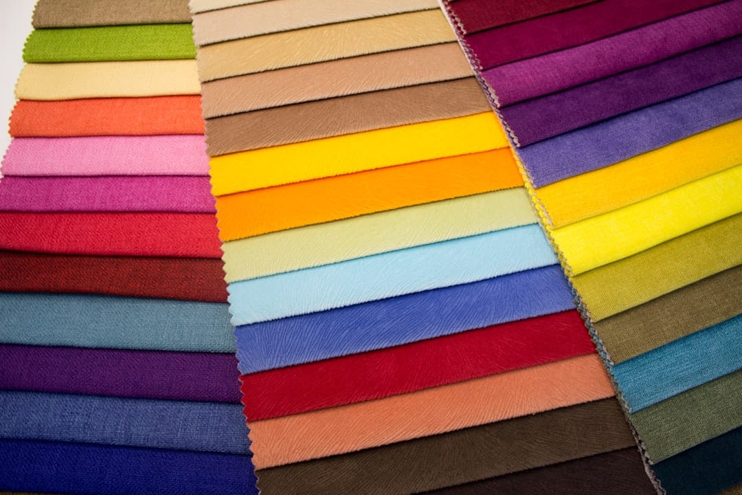
Each hue carries its own set of associations and meanings, which can vary across cultures and contexts. For instance, the color red often symbolizes passion and energy, while blue is frequently associated with calmness and trust.
This intrinsic connection between color and emotion is not merely theoretical; it has practical implications for branding, marketing, and design. By understanding the psychological impact of colors, I can make informed decisions that resonate with my audience on a deeper level. Moreover, the psychological effects of color can be harnessed to create specific atmospheres or moods.
For example, warm colors like orange and yellow can stimulate feelings of happiness and enthusiasm, making them ideal for brands that want to convey a sense of friendliness and approachability. On the other hand, cooler colors such as green and purple can evoke feelings of tranquility and luxury, respectively. As I explore these nuances, I realize that selecting the right colors is not just about aesthetics; it’s about crafting an emotional narrative that aligns with my brand’s message and values.
Key Takeaways
- Different colors can evoke different emotions and reactions in people, so it’s important to understand the psychology of color when choosing a color scheme for your brand.
- Your brand identity should be reflected in the colors you choose, so consider the message and values you want to convey when selecting a color palette.
- When designing for user experience, consider how color can enhance or detract from the usability of your product or website.
- It’s important to ensure that your color choices are accessible to all users, including those with visual impairments, so consider inclusivity in your color palette.
- Utilize color contrast to improve readability and make sure that your content is easily legible for all users.
- Test and refine your color scheme to ensure that it is achieving the desired results and resonating with your target audience.
Considering Your Brand Identity
The Power of Color in Brand Perception
As I consider my brand identity, I understand that color plays a pivotal role in shaping how my brand is perceived. The colors I choose should align with the essence of my brand and communicate its core attributes effectively.
Choosing Colors that Align with My Brand
For instance, if my brand is centered around sustainability and eco-friendliness, I might gravitate towards earthy tones like greens and browns that evoke a sense of nature and responsibility. Conversely, if my brand is focused on innovation and technology, I may opt for sleek blues or metallics that suggest modernity and forward-thinking.
Creating a Cohesive Visual Language
By carefully considering how my color choices reflect my brand identity, I can create a cohesive visual language that resonates with my target audience and fosters brand loyalty.
Choosing a Color Palette that Enhances User Experience

As I embark on the journey of selecting a color palette for my project, I realize that it’s essential to prioritize user experience. A well-thought-out color scheme can significantly enhance usability and navigation, making it easier for users to engage with my content.
In this process, I often find myself experimenting with various combinations of colors to strike the right balance between aesthetics and functionality. For example, I might choose a primary color that captures attention while using complementary shades for backgrounds and accents. This approach not only creates visual interest but also helps in organizing information effectively.
By ensuring that my color palette enhances user experience, I can foster a more engaging environment that encourages exploration and interaction.
Accessibility and Inclusivity in Color Choices
| Color Contrast Ratio | Color Blindness Friendly | Readable Font Size |
|---|---|---|
| 4.5:1 for normal text, 3:1 for large text | Use of distinct hues and patterns | Minimum 16px for body text, 12px for small text |
As I navigate the complexities of color selection, I am increasingly aware of the importance of accessibility and inclusivity. It’s crucial to recognize that not all users perceive colors in the same way; factors such as color blindness or visual impairments can significantly impact how individuals interact with my content. Therefore, I strive to create a color scheme that is inclusive and considerate of diverse audiences.
To achieve this, I often refer to accessibility guidelines that provide insights into color contrast ratios and combinations that are easier for everyone to perceive. For instance, using high-contrast colors for text against backgrounds ensures readability for individuals with visual impairments. Additionally, incorporating patterns or textures alongside color can further enhance accessibility by providing alternative cues for navigation.
By prioritizing inclusivity in my color choices, I can create an environment where all users feel welcome and valued.
Utilizing Color Contrast for Readability
In my quest for effective design, I have come to appreciate the critical role of color contrast in ensuring readability. The interplay between foreground and background colors can make or break the user experience. If the contrast is too low, text may become difficult to read, leading to frustration and disengagement.
Therefore, I pay close attention to how colors interact with one another to maintain clarity and legibility. For example, when designing a website or creating marketing materials, I often test various combinations to find the optimal contrast levels. Dark text on a light background tends to be more readable than light text on a dark background; however, there are exceptions based on context and design goals.
By utilizing tools that assess color contrast ratios, I can ensure that my designs meet accessibility standards while still being visually appealing. This commitment to readability not only enhances user experience but also reflects my dedication to creating thoughtful and inclusive designs.
Testing and Refining Your Color Scheme for Optimal Results

Seeking Feedback from Real Users
As I finalize my color scheme, I understand that testing and refinement are crucial steps in the design process. It’s not enough to simply choose colors based on intuition; I need to gather feedback from real users to gauge their reactions and experiences. By conducting usability tests or surveys, I can gain valuable insights into how my audience perceives the colors I’ve chosen.
Iterative Refinement and Adaptation
Through this iterative process, I often discover unexpected preferences or challenges that prompt me to make adjustments. For instance, a color that seemed appealing in theory may not resonate as well in practice due to cultural associations or personal preferences among users. By remaining open to feedback and willing to adapt my color choices accordingly, I can create a more effective and engaging design that truly meets the needs of my audience.
The Multifaceted Nature of Color Selection
In conclusion, the journey of selecting colors for branding or design is multifaceted and deeply impactful. From understanding the psychology behind colors to considering brand identity, user experience, accessibility, contrast, and ongoing testing, each step plays a vital role in crafting a successful visual narrative. As I continue to explore this dynamic field, I am reminded of the power of color as a tool for communication and connection in an increasingly visual world.
FAQs
What is a website color scheme?
A website color scheme refers to the combination of colors used in the design of a website. It includes the main color, accent colors, and any complementary or contrasting colors used throughout the site.
Why is selecting a website color scheme important?
Selecting a website color scheme is important because it can impact the overall look and feel of the website, as well as the user experience. Colors can evoke certain emotions and convey brand identity, so choosing the right color scheme is crucial for creating a visually appealing and cohesive website.
What are some popular website color schemes?
Some popular website color schemes include monochromatic (using variations of a single color), complementary (using colors opposite each other on the color wheel), analogous (using colors next to each other on the color wheel), and triadic (using three colors evenly spaced on the color wheel).
How can I select a website color scheme?
When selecting a website color scheme, consider the brand’s identity, target audience, and the emotions or feelings you want to evoke. It’s also important to ensure that the colors are accessible and readable for all users, including those with visual impairments.
What tools can I use to create a website color scheme?
There are various online tools available to help create a website color scheme, such as Adobe Color, Coolors, and Canva’s color palette generator. These tools allow you to explore different color combinations and create a cohesive color scheme for your website.


Leave a Reply